Logistics Analysis
Contents
Logistics Analysis
In this example, we will analyze the accuracy of a public transit system. The example, is analyzing three lines in Seattle, and it is based on the great blog post The Waiting Time Paradox, or, Why Is My Bus Always Late?

import pandas as pd
import numpy as np
Loading the data
The data that we have is capturing a couple of bus lines in Seattle, WA. Here is a map of the various lines that operate in the city.
from IPython.display import Image
Image(url='http://jakevdp.github.io/images/seattle-transit-map.png')
url = 'https://gist.githubusercontent.com/jakevdp/82409002fcc5142a2add0168c274a869/raw/1bbabf78333306dbc45b9f33662500957b2b6dc3/arrival_times.csv'

import requests
from io import StringIO

response = requests.get(url)
response
<Response [200]>
The CSV file is read through a URL and therefore, we need to convert the text of the response to a simple string as we get when we read a local file. For that we will use the StringIO functionality as follows:
bus_arrival_times = (
    pd
    .read_csv(
        StringIO(
            response.text
        )
    )
)

bus_arrival_times
| OPD_DATE | VEHICLE_ID | RTE | DIR | TRIP_ID | STOP_ID | STOP_NAME | SCH_STOP_TM | ACT_STOP_TM | |
|---|---|---|---|---|---|---|---|---|---|
| 0 | 2016-03-26 | 6201 | 673 | S | 30908177 | 431 | 3RD AVE & PIKE ST (431) | 01:11:57 | 01:13:19 |
| 1 | 2016-03-26 | 6201 | 673 | S | 30908033 | 431 | 3RD AVE & PIKE ST (431) | 23:19:57 | 23:16:13 |
| 2 | 2016-03-26 | 6201 | 673 | S | 30908028 | 431 | 3RD AVE & PIKE ST (431) | 21:19:57 | 21:18:46 |
| 3 | 2016-03-26 | 6201 | 673 | S | 30908019 | 431 | 3RD AVE & PIKE ST (431) | 19:04:57 | 19:01:49 |
| 4 | 2016-03-26 | 6201 | 673 | S | 30908252 | 431 | 3RD AVE & PIKE ST (431) | 16:42:57 | 16:42:39 |
| ... | ... | ... | ... | ... | ... | ... | ... | ... | ... |
| 39152 | 2016-05-27 | 6215 | 674 | N | 30905957 | 578 | 3RD AVE & PIKE ST (578) | 10:50:25 | 10:49:50 |
| 39153 | 2016-05-27 | 6215 | 674 | N | 30905720 | 578 | 3RD AVE & PIKE ST (578) | 13:02:27 | 13:07:10 |
| 39154 | 2016-05-27 | 6215 | 674 | N | 30905729 | 578 | 3RD AVE & PIKE ST (578) | 15:14:29 | 15:15:55 |
| 39155 | 2016-05-27 | 6215 | 674 | N | 30905740 | 578 | 3RD AVE & PIKE ST (578) | 17:26:29 | 17:25:40 |
| 39156 | 2016-05-27 | 6216 | 674 | N | 30905885 | 578 | 3RD AVE & PIKE ST (578) | 18:06:29 | 18:07:01 |
39157 rows × 9 columns
Data Exploration
Let’s check how many days, buses, routes, trips, stops, etc. do we have in the data.
Start with the bus arrival times data above
Convert every cell to string value
Describe the table (count, unique values, top and frequency)
Focus only on the unique values count
(
    bus_arrival_times
    .astype(str)
    .describe()
    .loc['unique']
)
OPD_DATE          63
VEHICLE_ID       115
RTE                3
DIR                2
TRIP_ID         1660
STOP_ID            2
STOP_NAME          2
SCH_STOP_TM     1357
ACT_STOP_TM    27633
Name: unique, dtype: object
We see that we have 63 days of data, for 115 buses, in 3 lines (RTE) and 2 directions and schedule and arrival times in 2 stops over 1660 trips.
Data Cleanup
Let’s make the data easier to understand and to calculate the accuracy of the lines
Start with the bus arrival times table above
Filter out invalid records with TRIP_ID = 0
Create a scheduled column timestamp with the combination of the date and the scheduled stop time
Create a actual column timestamp with the combination of the date and the actual stop time
Calculate the difference between the above timestamps
Calculate the difference in minutes by scaling to seconds and then 60 (seconds in a minute)
Fix the rows that fall across midnights (difference larger than 1000 minutes)
Add a column with the route symbol (C, D or E)
Add a column with the direction of the trip (northbound or southbound)
Focus only on the new columns we created here
trips_accuracy = (
    bus_arrival_times
    .query('TRIP_ID > 0')
    .assign(scheduled = lambda x : pd.to_datetime(x.OPD_DATE + ' ' + x.SCH_STOP_TM, errors='raise'))
    .assign(actual = lambda x : pd.to_datetime(x.OPD_DATE + ' ' + x.ACT_STOP_TM))
    .assign(
        time_diff = lambda x : (x.actual - x.scheduled)
    )
    .assign(
        minutes_late = lambda x : x.time_diff.dt.total_seconds() / 60
    )
    .assign(minutes_late = lambda x: np.where(
        x.minutes_late < 1000,
        x.minutes_late,
        x.minutes_late - 60*24)
    )
    .assign(minutes_late = lambda x: np.where(
        x.minutes_late > -1000,
        x.minutes_late,
        x.minutes_late + 60*24)
    )
    .assign(route = lambda x: x.RTE.replace({
        673: 'C',
        674: 'D',
        675: 'E'})
        .astype('category')
    )
    .assign(direction = lambda x :x.DIR.replace({
        'N': 'northbound',
        'S': 'southbound'})
        .astype('category')
    )
    .loc[:,['route', 'direction', 'scheduled', 'actual', 'minutes_late']]
)
trips_accuracy
| route | direction | scheduled | actual | minutes_late | |
|---|---|---|---|---|---|
| 0 | C | southbound | 2016-03-26 01:11:57 | 2016-03-26 01:13:19 | 1.366667 |
| 1 | C | southbound | 2016-03-26 23:19:57 | 2016-03-26 23:16:13 | -3.733333 |
| 2 | C | southbound | 2016-03-26 21:19:57 | 2016-03-26 21:18:46 | -1.183333 |
| 3 | C | southbound | 2016-03-26 19:04:57 | 2016-03-26 19:01:49 | -3.133333 |
| 4 | C | southbound | 2016-03-26 16:42:57 | 2016-03-26 16:42:39 | -0.300000 |
| ... | ... | ... | ... | ... | ... |
| 39152 | D | northbound | 2016-05-27 10:50:25 | 2016-05-27 10:49:50 | -0.583333 |
| 39153 | D | northbound | 2016-05-27 13:02:27 | 2016-05-27 13:07:10 | 4.716667 |
| 39154 | D | northbound | 2016-05-27 15:14:29 | 2016-05-27 15:15:55 | 1.433333 |
| 39155 | D | northbound | 2016-05-27 17:26:29 | 2016-05-27 17:25:40 | -0.816667 |
| 39156 | D | northbound | 2016-05-27 18:06:29 | 2016-05-27 18:07:01 | 0.533333 |
38917 rows × 5 columns
Data Visualization
Accuracy Histogram
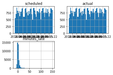
We can quickly graph the distribution of the accuracy
(
    trips_accuracy
    .hist(bins=50)
);
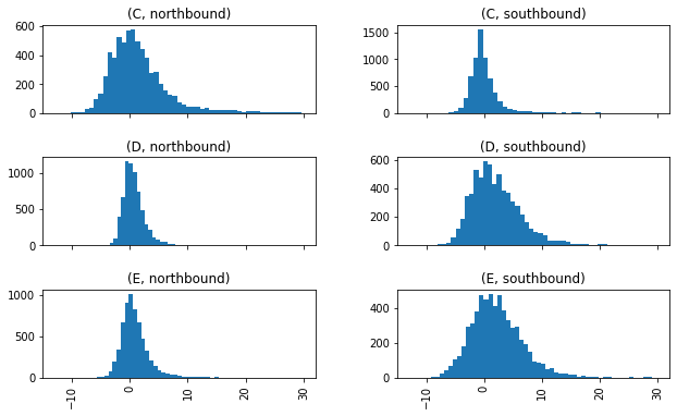
Or even break it down by the different routes and directions to see if the grouops are behaving in a similar way
(
    trips_accuracy
    .query('minutes_late < 30')
    .hist(
        bins=50,
        sharex=True,
        by=['route','direction'],
        figsize=(10,6)
    )
);
Fancier Visualization
The default visualization functionality of Pandas is often enhanced with a set of graphic libraries that we will cover in a dedicated chapter. Here is an improved visualization using Seaborn.
%pip install seaborn --quiet
Note: you may need to restart the kernel to use updated packages.
import seaborn as sns
import matplotlib.pyplot as plt
g = (
    sns
    .FacetGrid(
        trips_accuracy,
        row="direction",
        col="route"
    )
)

g.map(
    plt.hist,
    "minutes_late",
    bins=np.arange(-10, 20)
)
g.set_titles('{col_name} {row_name}')
g.set_axis_labels('minutes late', 'number of trips');
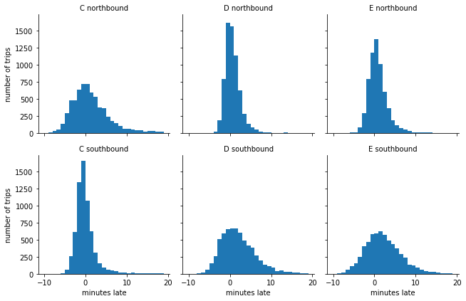
You might expect that the buses stick closer to their schedule near the beginning of each one-way trip and show more spread near the end, and this is borne out in the data: the southbound C-line and northbound D and E lines are near the beginning of their respective routes, and in the opposite direction they are near the end.
Scheduled and Actual Arrival Intervals
Start with the trips_accuracy table above
Sort the value based on the Scheduled time
Group by route and direction
Focus only on the Scheduled and actual time columns
calculate the diff between every adjacent trips in each Group
Convert null values to 0
Convert the time delta values to minutes
Merge with the original table based on the similar index of both tables
Change the name of the column from the diff table to include the suffix _interval
trips_intervals = (
    trips_accuracy
    .sort_values('scheduled')
    .groupby(['route', 'direction'])
    ['scheduled','actual']
    .diff()
    .fillna(pd.Timedelta(seconds=0))
    .astype('timedelta64[m]')
    .merge(
        trips_accuracy,
        left_index=True,
        right_index=True,
        suffixes=("_interval","")
    )
)
trips_intervals
/opt/hostedtoolcache/Python/3.7.13/x64/lib/python3.7/site-packages/ipykernel_launcher.py:5: FutureWarning: Indexing with multiple keys (implicitly converted to a tuple of keys) will be deprecated, use a list instead.
  """
| scheduled_interval | actual_interval | route | direction | scheduled | actual | minutes_late | |
|---|---|---|---|---|---|---|---|
| 19512 | 0.0 | 0.0 | C | northbound | 2016-03-26 00:00:25 | 2016-03-26 00:05:01 | 4.600000 |
| 79 | 0.0 | 0.0 | C | southbound | 2016-03-26 00:04:57 | 2016-03-26 00:05:18 | 0.350000 |
| 19725 | 0.0 | 0.0 | D | northbound | 2016-03-26 00:05:25 | 2016-03-26 00:05:06 | -0.316667 |
| 155 | 0.0 | 0.0 | E | southbound | 2016-03-26 00:27:59 | 2016-03-26 00:28:04 | 0.083333 |
| 19569 | 0.0 | 0.0 | E | northbound | 2016-03-26 00:28:10 | 2016-03-26 00:29:46 | 1.600000 |
| ... | ... | ... | ... | ... | ... | ... | ... |
| 19462 | 15.0 | 13.0 | D | southbound | 2016-05-27 23:44:58 | 2016-05-27 23:45:36 | 0.633333 |
| 4609 | 15.0 | 16.0 | C | southbound | 2016-05-27 23:49:57 | 2016-05-27 23:49:35 | -0.366667 |
| 9735 | 30.0 | 27.0 | E | southbound | 2016-05-27 23:53:59 | 2016-05-27 23:57:15 | 3.266667 |
| 29313 | 30.0 | 30.0 | E | northbound | 2016-05-27 23:55:10 | 2016-05-27 23:54:09 | -1.016667 |
| 19426 | 15.0 | -1425.0 | D | southbound | 2016-05-27 23:59:58 | 2016-05-27 00:01:28 | 1.500000 |
38917 rows × 7 columns
We can see that we have a few issues with the midnights and some of the interval are a day apart. Previously, we fixed it in the flow, however, now we can use a function that is fixing this issues on a specific column to simplify our code.
Start with the given table
If the value is smaller than 1,000
Assign to the given column name the original value of the column
Otheriwse, assign a value that is (60 minutes by 24 hours) minutes smaller
Repeat for values that are larger than -1,000
def fix_midnights(df, col_name):
    fixed_df = (
        df
        .assign(**{col_name : lambda x: np.where(
            x[col_name] < 1_000,
            x[col_name],
            x[col_name] - 60*24)}
        )
        .assign(**{col_name : lambda x: np.where(
            x[col_name] > -1_000,
            x[col_name],
            x[col_name] + 60*24)}
        )
    )
    return fixed_df
Now that we have a business logic function that can fix the midnight problem that we saw in our data, we can apply on the two problematic columns in our table:
Start with the trip intervals table above
Fix the midnight problem in scheduled_interval column
Fix the midnight problem in actual_interval column
fixed_trip_intervals = (
    trips_intervals
    .pipe(fix_midnights, 'scheduled_interval')
    .pipe(fix_midnights, 'actual_interval')
)
fixed_trip_intervals
| scheduled_interval | actual_interval | route | direction | scheduled | actual | minutes_late | |
|---|---|---|---|---|---|---|---|
| 19512 | 0.0 | 0.0 | C | northbound | 2016-03-26 00:00:25 | 2016-03-26 00:05:01 | 4.600000 |
| 79 | 0.0 | 0.0 | C | southbound | 2016-03-26 00:04:57 | 2016-03-26 00:05:18 | 0.350000 |
| 19725 | 0.0 | 0.0 | D | northbound | 2016-03-26 00:05:25 | 2016-03-26 00:05:06 | -0.316667 |
| 155 | 0.0 | 0.0 | E | southbound | 2016-03-26 00:27:59 | 2016-03-26 00:28:04 | 0.083333 |
| 19569 | 0.0 | 0.0 | E | northbound | 2016-03-26 00:28:10 | 2016-03-26 00:29:46 | 1.600000 |
| ... | ... | ... | ... | ... | ... | ... | ... |
| 19462 | 15.0 | 13.0 | D | southbound | 2016-05-27 23:44:58 | 2016-05-27 23:45:36 | 0.633333 |
| 4609 | 15.0 | 16.0 | C | southbound | 2016-05-27 23:49:57 | 2016-05-27 23:49:35 | -0.366667 |
| 9735 | 30.0 | 27.0 | E | southbound | 2016-05-27 23:53:59 | 2016-05-27 23:57:15 | 3.266667 |
| 29313 | 30.0 | 30.0 | E | northbound | 2016-05-27 23:55:10 | 2016-05-27 23:54:09 | -1.016667 |
| 19426 | 15.0 | 15.0 | D | southbound | 2016-05-27 23:59:58 | 2016-05-27 00:01:28 | 1.500000 |
38917 rows × 7 columns
Data Visualization
Actual Intervals Distribution
Create grid of graphs from the fixed trip intervals table
each row will have a different direction
each column will have a different route
In each graph create an histogram with the actual interval value
with bins between 0 and 50
Add a title for each graph with the route and direction
Add labels to the axis
g = (
    sns
    .FacetGrid(
        fixed_trip_intervals,
        row="direction",
        col="route"
    )
)
g.map(
    plt.hist,
    "actual_interval",
    bins=np.arange(50)
)
g.set_titles('{col_name} {row_name}')
g.set_axis_labels('actual interval (minutes)', 'number of buses');
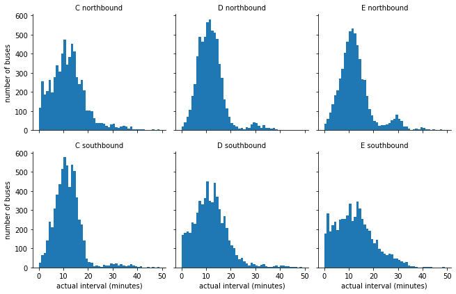
the distributions may be affected by non-constant scheduled arrival intervals. Let’s understand the different intervals that are scheduled. We will repeat the graphs logic above and plot the schedule interval instead of the actual ones.
g = (
    sns
    .FacetGrid(
        fixed_trip_intervals,
        row="direction",
        col="route"
    )
)
g.map(plt.hist, "scheduled_interval", bins=np.arange(20) - 0.5)
g.set_titles('{col_name} {row_name}')
g.set_axis_labels('scheduled interval (minutes)', 'frequency');
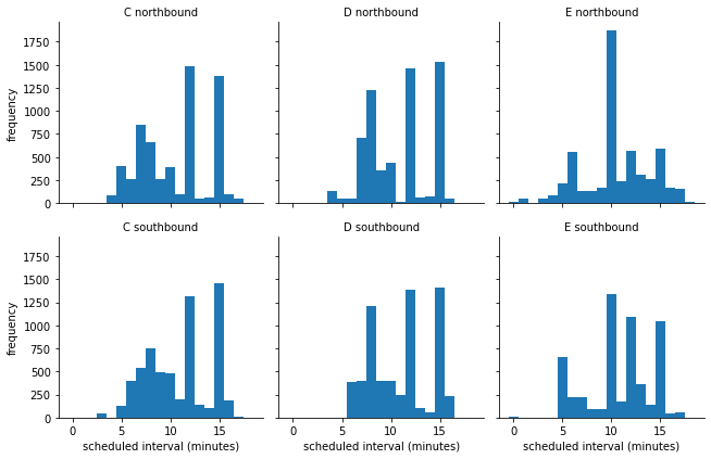
Heat Maps
We can see the most of the lines have 7, 12 and 15 minutes interval for most of the trips. If we to see the heat map of the interval plans, we can add the hour and the day-of-week (dow) to the table using eval:
Start with the fixed trip intervals table above
Add a column with the hour in the day of each trip
Add a column with the name of the day in the week
Convert the name of the day to be an ordered category based on the day names from the calendar (it will make the order of the days in the graph to be as expected and not alphabetic)
from pandas.api.types import CategoricalDtype
import calendar
trip_intervals_with_time = (
    fixed_trip_intervals
    .eval("hour = scheduled.dt.hour")
    .assign(dow = lambda x : x.scheduled.dt.day_name().astype(
        CategoricalDtype(
            ordered=True,
            categories=list(calendar.day_name))
        )
    )
)
trip_intervals_with_time
| scheduled_interval | actual_interval | route | direction | scheduled | actual | minutes_late | hour | dow | |
|---|---|---|---|---|---|---|---|---|---|
| 19512 | 0.0 | 0.0 | C | northbound | 2016-03-26 00:00:25 | 2016-03-26 00:05:01 | 4.600000 | 0 | Saturday |
| 79 | 0.0 | 0.0 | C | southbound | 2016-03-26 00:04:57 | 2016-03-26 00:05:18 | 0.350000 | 0 | Saturday |
| 19725 | 0.0 | 0.0 | D | northbound | 2016-03-26 00:05:25 | 2016-03-26 00:05:06 | -0.316667 | 0 | Saturday |
| 155 | 0.0 | 0.0 | E | southbound | 2016-03-26 00:27:59 | 2016-03-26 00:28:04 | 0.083333 | 0 | Saturday |
| 19569 | 0.0 | 0.0 | E | northbound | 2016-03-26 00:28:10 | 2016-03-26 00:29:46 | 1.600000 | 0 | Saturday |
| ... | ... | ... | ... | ... | ... | ... | ... | ... | ... |
| 19462 | 15.0 | 13.0 | D | southbound | 2016-05-27 23:44:58 | 2016-05-27 23:45:36 | 0.633333 | 23 | Friday |
| 4609 | 15.0 | 16.0 | C | southbound | 2016-05-27 23:49:57 | 2016-05-27 23:49:35 | -0.366667 | 23 | Friday |
| 9735 | 30.0 | 27.0 | E | southbound | 2016-05-27 23:53:59 | 2016-05-27 23:57:15 | 3.266667 | 23 | Friday |
| 29313 | 30.0 | 30.0 | E | northbound | 2016-05-27 23:55:10 | 2016-05-27 23:54:09 | -1.016667 | 23 | Friday |
| 19426 | 15.0 | 15.0 | D | southbound | 2016-05-27 23:59:58 | 2016-05-27 00:01:28 | 1.500000 | 23 | Friday |
38917 rows × 9 columns
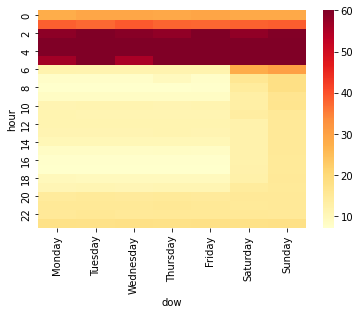
To plot the heatmap we will use the built-in heatmap graph of Seaborn library:
Start with the trip intervals table with the hour and dow above
Take only the hour, dow and scheduled interval columns
Create a pivot table with hour as the index and dow as columns (with mean as default aggregation function)
Clip values that are larger than 60 minutes to 60
Remove the first level of the columns names (the name of the calculated column scheduled interval)
sns.heatmap(
    trip_intervals_with_time
    [['hour','dow','scheduled_interval']]
    .pivot_table(index='hour', columns='dow')
    .clip(upper=60)
    .droplevel(0, axis='columns'),
    cmap="YlOrRd"
);
As expected the larger intervals are during the night (between midnight and 5 AM) and the shortest are during the rush hours of the morning and afternoon. We can also see the Saturday and Sunday have longer interval as expected.
Let’s check how the actual arrival times behave across the week and create a similar heatmap of the minute late column that we calculated above.
sns.heatmap(
    trip_intervals_with_time
    [['hour','dow','minutes_late']]
    .pivot_table(index='hour', columns='dow')
    .clip(upper=60)
    .droplevel(0, axis='columns'),
    cmap="YlOrRd"
);
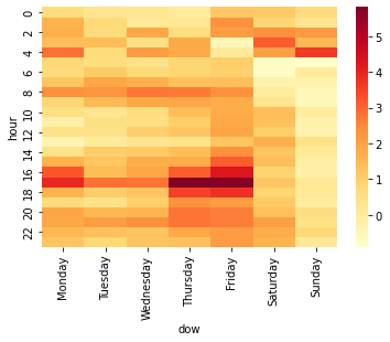
Most of the problems are at 5 PM mostly on Monday, Thursday and Friday. We can also see some higher delay on the last shift of the night at 4 AM, however, it is probably not affecting that many people like the delays of the rush hours of the afternoon.
Let’s break it down by route:
minutes_late_heatmap_by_route = (
    trip_intervals_with_time
    [['hour','dow','minutes_late','route']]
    .pivot_table(index=['route','hour'], columns=['dow'])
    .clip(upper=60)
    .droplevel(0, axis='columns')
)
Heatmap as a table with values
This time we will create the heat map more similar to the way it will be presented in Excel using style (similar to Conditional Formatting in Excel):
Start with the pivot table per route
Apply style to table
Format the values to be with up to 2 digits of precision
Apply conditional backgroud to each cell with gradient from yellow to orange to red
(
    minutes_late_heatmap_by_route
    .style
    .format("{:.2}", na_rep="-")
    .background_gradient(cmap='YlOrRd')
)
| dow | Monday | Tuesday | Wednesday | Thursday | Friday | Saturday | Sunday | |
|---|---|---|---|---|---|---|---|---|
| route | hour | |||||||
| C | 0 | -0.017 | -1.4 | -1.0 | -0.67 | -0.62 | 1.6 | 0.98 |
| 1 | 0.33 | -0.21 | -1.3 | -0.67 | 0.34 | -0.25 | -1.9 | |
| 2 | 0.14 | -0.68 | 1.2 | 1.3 | 0.4 | 2.1 | 2.1 | |
| 3 | 0.36 | 0.91 | -2.1 | 1.5 | - | - | 0.15 | |
| 4 | 3.6 | -1.6 | 5.0 | 1.5 | - | - | 4.0 | |
| 5 | 1.2 | 0.61 | 0.39 | 0.51 | -0.0023 | -0.55 | -0.37 | |
| 6 | 0.33 | 0.42 | 0.16 | 0.04 | 0.28 | -0.7 | 0.018 | |
| 7 | 1.7 | 2.2 | 2.1 | 1.6 | 2.0 | 0.36 | -0.51 | |
| 8 | 2.3 | 2.5 | 2.6 | 3.7 | 4.3 | -0.58 | -1.7 | |
| 9 | 1.0 | 2.0 | 2.7 | 2.5 | 2.8 | 0.73 | -2.3 | |
| 10 | -0.33 | -0.44 | -0.46 | 1.1 | 0.98 | 1.7 | -1.9 | |
| 11 | -1.4 | -0.93 | -0.11 | 0.23 | 1.4 | 3.1 | -1.7 | |
| 12 | -0.57 | -1.2 | -0.23 | -0.19 | 0.96 | 0.88 | -1.2 | |
| 13 | -2.0 | -1.8 | -1.0 | -0.83 | -0.082 | 2.3 | -0.51 | |
| 14 | 0.01 | 0.12 | 0.69 | 0.052 | 1.1 | 2.0 | -1.2 | |
| 15 | 0.52 | 0.19 | 0.54 | 1.3 | 2.1 | 1.9 | -1.9 | |
| 16 | 2.1 | 1.6 | 2.0 | 2.8 | 4.8 | 1.6 | -1.8 | |
| 17 | 4.1 | 3.4 | 3.4 | 6.7 | 6.5 | 0.51 | -1.2 | |
| 18 | 2.6 | 1.2 | 1.7 | 4.8 | 5.3 | -0.00075 | -0.74 | |
| 19 | 0.24 | -0.1 | 0.4 | 1.8 | 2.3 | 2.0 | 0.27 | |
| 20 | 2.1 | 1.5 | 0.52 | 2.6 | 2.7 | 2.5 | 1.1 | |
| 21 | 1.6 | 0.88 | 1.8 | 2.9 | 2.7 | 3.4 | 0.044 | |
| 22 | 0.34 | 0.39 | -0.1 | 1.5 | 0.99 | 2.1 | 0.52 | |
| 23 | -0.37 | -0.67 | -0.91 | 0.27 | -0.28 | 1.1 | -1.2 | |
| D | 0 | 0.11 | 1.0 | 0.088 | -0.11 | 1.7 | 1.6 | 2.4 |
| 1 | 3.6 | 0.68 | 0.12 | 1.1 | 4.0 | 3.0 | 3.1 | |
| 2 | 2.2 | 1.7 | 3.6 | 2.2 | 1.8 | 3.1 | 3.1 | |
| 3 | 2.0 | 1.8 | 1.7 | 2.1 | -0.5 | 3.1 | 2.5 | |
| 4 | 2.6 | 1.4 | 1.1 | 1.8 | 0.071 | 2.0 | 3.2 | |
| 5 | 0.4 | 0.12 | 0.28 | 0.69 | 1.3 | -1.8 | -1.4 | |
| 6 | 0.82 | 1.2 | 0.91 | 1.3 | 1.2 | -0.77 | -0.38 | |
| 7 | 0.55 | 1.1 | 1.1 | 0.76 | 0.51 | -1.5 | -0.3 | |
| 8 | 2.7 | 2.4 | 2.8 | 2.1 | 1.3 | 0.0045 | -0.95 | |
| 9 | 0.42 | 1.2 | 1.8 | 2.0 | 1.1 | -0.64 | -0.46 | |
| 10 | 0.52 | 0.28 | 0.19 | 0.84 | 1.7 | 0.94 | 0.36 | |
| 11 | -0.0036 | 1.1 | 0.93 | 1.3 | 1.9 | 1.2 | 0.2 | |
| 12 | 0.57 | 0.82 | 0.78 | 1.7 | 2.2 | 0.65 | -0.02 | |
| 13 | 0.45 | 1.3 | 1.2 | 0.89 | 1.2 | 1.7 | 0.78 | |
| 14 | 0.19 | 0.9 | 1.3 | 1.5 | 1.5 | 0.77 | 0.44 | |
| 15 | 2.5 | 1.9 | 2.3 | 1.7 | 3.3 | 1.3 | 0.17 | |
| 16 | 4.7 | 0.43 | 0.62 | 2.2 | 3.1 | 1.5 | 0.086 | |
| 17 | 5.2 | 1.9 | 2.1 | 6.8 | 6.5 | 2.4 | 0.4 | |
| 18 | 1.5 | 1.4 | 1.3 | 4.8 | 3.8 | 2.5 | 1.5 | |
| 19 | 1.4 | 0.43 | 0.93 | 4.2 | 2.2 | 1.4 | 0.65 | |
| 20 | 2.3 | 1.3 | 2.3 | 3.4 | 3.2 | 1.7 | 1.2 | |
| 21 | 2.5 | 2.4 | 2.6 | 4.0 | 2.9 | 3.4 | 2.5 | |
| 22 | 1.9 | 1.1 | 1.2 | 1.7 | 3.2 | 3.4 | 2.3 | |
| 23 | 2.0 | 1.3 | 2.0 | 2.0 | 3.7 | 3.4 | 2.3 | |
| E | 0 | 1.7 | 1.4 | 1.6 | 0.81 | 2.5 | 0.15 | -0.89 |
| 1 | 0.92 | 1.9 | 1.5 | 0.17 | 2.8 | -0.23 | -0.33 | |
| 2 | 2.8 | 1.2 | 0.9 | -1.2 | 4.3 | 1.9 | 1.1 | |
| 3 | 2.3 | 1.3 | 2.3 | 2.8 | - | 3.3 | 2.8 | |
| 5 | 0.85 | 1.3 | 0.56 | 1.4 | 1.6 | 2.8 | -0.47 | |
| 6 | 0.89 | 1.9 | 1.3 | 1.5 | 1.6 | -0.85 | 1.0 | |
| 7 | 1.1 | 2.2 | 1.7 | 1.5 | 1.4 | 0.28 | 0.29 | |
| 8 | 2.2 | 1.9 | 2.8 | 2.2 | 1.1 | 0.77 | 1.8 | |
| 9 | 1.0 | 1.1 | 1.2 | 1.3 | 1.3 | 0.93 | 1.1 | |
| 10 | 1.1 | 0.85 | 2.0 | 2.1 | 2.5 | 1.6 | 1.5 | |
| 11 | 0.75 | 1.2 | 0.76 | 1.4 | 2.1 | -0.39 | 0.74 | |
| 12 | 1.2 | 1.4 | 2.2 | 1.9 | 2.5 | 1.5 | 0.25 | |
| 13 | 0.21 | 0.53 | 0.58 | 0.88 | 2.3 | 1.0 | 0.98 | |
| 14 | 1.0 | 2.1 | 1.2 | 2.5 | 4.6 | 0.93 | 1.1 | |
| 15 | 1.8 | 1.7 | 2.5 | 2.6 | 4.2 | 0.9 | 1.3 | |
| 16 | 2.8 | 2.3 | 3.1 | 4.4 | 4.9 | -0.32 | 1.1 | |
| 17 | 2.7 | 3.1 | 2.9 | 3.9 | 4.3 | 0.61 | 1.2 | |
| 18 | 0.62 | 0.36 | 0.69 | 0.7 | 2.1 | -0.35 | -0.39 | |
| 19 | 0.29 | 0.77 | 1.5 | 0.85 | 2.0 | 0.066 | -1.0 | |
| 20 | 1.3 | 1.7 | 1.8 | 2.4 | 2.1 | -0.27 | -0.68 | |
| 21 | 1.5 | 3.0 | 2.7 | 1.4 | 2.5 | -0.66 | -1.3 | |
| 22 | 2.2 | 2.4 | 2.5 | 2.3 | 2.3 | -0.48 | -0.57 | |
| 23 | 2.3 | 2.2 | 3.2 | 1.9 | 3.5 | -0.37 | -1.2 |
Now it is easy to see the 5-7 minutes delays during the rush hours of the C and D routes. We can also explore other problemaic times on Saturday, etc.