Group numeric values into categories (bins)
Contents
Group numeric values into categories (bins)
We often have a column with many numeric values and we want into group them to bins or buckets, such as age groups or value tiers. In Excel we can do it using and of the following options:
Data Menu -> Data Analysis -> Histogram or Rank and Percentile
VLOOKUP (
=LOOKUP(A1,{0,7,14,31,90,180,360},{"0-6","7-13","14-30","31-89","90-179","180-359",">360"}), for example), orIF (
=if(b2>30,"large",if(A1>20,"medium",if(A1>=10,"small",if(A1<10,"tiny","")))), for example)INDEX (
=INDEX({"Small","Medium","Large"},LARGE(IF(A1>{0,11,21},{1,2,3}),1)), for example)

Cut Function
Since this is a common need, Pandas has built-in functions cut and qcut that make it more flexible and accurate. We start with importing pandas.
import pandas as pd
Real-life example
Let’s analyze data regarding the impact of weatehr information on numbers of bike rentals. We know that when it is too cold or too hot, people rent less bike. But what is the cutoff temperature value? When we listen to the next 10 days weather forecast, how should we prepare our bike rental fleet to meet the expected demand?
Loading Data
As usual, let’s load a dataset to work on. We will use the dataset that is used before, “Bike Share”. This is a data set about the demand of bike share service in Seoul. Please note that we need to modify the default encoding of read_csv from ‘UTF-8’ to ‘latin1’.
bike_share_data = (
    pd
    .read_csv(
        'https://archive.ics.uci.edu/ml/machine-learning-databases/00560/SeoulBikeData.csv',
        encoding='latin1'
    )
)
bike_share_data
| Date | Rented Bike Count | Hour | Temperature(°C) | Humidity(%) | Wind speed (m/s) | Visibility (10m) | Dew point temperature(°C) | Solar Radiation (MJ/m2) | Rainfall(mm) | Snowfall (cm) | Seasons | Holiday | Functioning Day | |
|---|---|---|---|---|---|---|---|---|---|---|---|---|---|---|
| 0 | 01/12/2017 | 254 | 0 | -5.2 | 37 | 2.2 | 2000 | -17.6 | 0.0 | 0.0 | 0.0 | Winter | No Holiday | Yes |
| 1 | 01/12/2017 | 204 | 1 | -5.5 | 38 | 0.8 | 2000 | -17.6 | 0.0 | 0.0 | 0.0 | Winter | No Holiday | Yes |
| 2 | 01/12/2017 | 173 | 2 | -6.0 | 39 | 1.0 | 2000 | -17.7 | 0.0 | 0.0 | 0.0 | Winter | No Holiday | Yes |
| 3 | 01/12/2017 | 107 | 3 | -6.2 | 40 | 0.9 | 2000 | -17.6 | 0.0 | 0.0 | 0.0 | Winter | No Holiday | Yes |
| 4 | 01/12/2017 | 78 | 4 | -6.0 | 36 | 2.3 | 2000 | -18.6 | 0.0 | 0.0 | 0.0 | Winter | No Holiday | Yes |
| ... | ... | ... | ... | ... | ... | ... | ... | ... | ... | ... | ... | ... | ... | ... |
| 8755 | 30/11/2018 | 1003 | 19 | 4.2 | 34 | 2.6 | 1894 | -10.3 | 0.0 | 0.0 | 0.0 | Autumn | No Holiday | Yes |
| 8756 | 30/11/2018 | 764 | 20 | 3.4 | 37 | 2.3 | 2000 | -9.9 | 0.0 | 0.0 | 0.0 | Autumn | No Holiday | Yes |
| 8757 | 30/11/2018 | 694 | 21 | 2.6 | 39 | 0.3 | 1968 | -9.9 | 0.0 | 0.0 | 0.0 | Autumn | No Holiday | Yes |
| 8758 | 30/11/2018 | 712 | 22 | 2.1 | 41 | 1.0 | 1859 | -9.8 | 0.0 | 0.0 | 0.0 | Autumn | No Holiday | Yes |
| 8759 | 30/11/2018 | 584 | 23 | 1.9 | 43 | 1.3 | 1909 | -9.3 | 0.0 | 0.0 | 0.0 | Autumn | No Holiday | Yes |
8760 rows × 14 columns
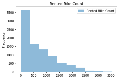
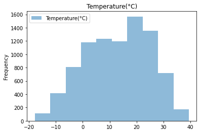
Simple Data Visulizations
Start with the table above
Create Histograms for numeric columns
Plot the histograms
(
    bike_share_data
    [['Rented Bike Count']]
    .plot(
        kind='hist',
        alpha=0.5,
        title='Rented Bike Count'
    )
);
(
    bike_share_data
    [['Temperature(°C)']]
    .plot(
        kind='hist',
        alpha=0.5,
        title='Temperature(°C)'
    )
);
Creating bins with Cut
Start with the table above
Focus on the temperature column
Create 5 bins
(
    pd
    .cut(
        bike_share_data
        ['Temperature(°C)'],
        5
    )
)
0       (-6.36, 5.08]
1       (-6.36, 5.08]
2       (-6.36, 5.08]
3       (-6.36, 5.08]
4       (-6.36, 5.08]
            ...
8755    (-6.36, 5.08]
8756    (-6.36, 5.08]
8757    (-6.36, 5.08]
8758    (-6.36, 5.08]
8759    (-6.36, 5.08]
Name: Temperature(°C), Length: 8760, dtype: category
Categories (5, interval[float64, right]): [(-17.857, -6.36] < (-6.36, 5.08] < (5.08, 16.52] < (16.52, 27.96] < (27.96, 39.4]]
We see the interval fo each of the bins:
[(-17.857, -6.36] < (-6.36, 5.08] < (5.08, 16.52] < (16.52, 27.96] < (27.96, 39.4]] that are in order and split to more or less equal sizes from temperature values perspective. Let’s see how well they split the data:
Split the temperature value into 5 bins
Count the number of records in each bin
Sort the values by the temperature range (the index of the series)
(
    pd
    .cut(
        bike_share_data
        ['Temperature(°C)'],
        5
    )
    .value_counts()
    .sort_index()
)
(-17.857, -6.36]     529
(-6.36, 5.08]       1989
(5.08, 16.52]       2428
(16.52, 27.96]      2923
(27.96, 39.4]        891
Name: Temperature(°C), dtype: int64
First, we see that the bins are in order when we sort them, and not by alphabetic order. More importanty, we see that they are not equal in size of records, and not based on any other meaningful split.
Setting the bins’ limits
We can set the bins to be more meaningful by setting the limits explicitly. As experts in bicycles, we might know the temperature ranges that are suitable for different accessories and clothings. Let’s fix the ranges based on this domain knowledge:
Split the temperature value into 5 bins based on bicycle professional ranges
Count the number of records in each bin
Sort the values by the temperature range (the index of the series)
(
    pd
    .cut(
        bike_share_data
        ['Temperature(°C)'],
        bins=[-18, 0, 8, 16, 24, 40]
    )
    .value_counts()
    .sort_index()
)
(-18, 0]    1454
(0, 8]      1731
(8, 16]     1651
(16, 24]    2148
(24, 40]    1776
Name: Temperature(°C), dtype: int64
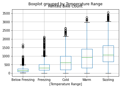
Adding meaningful labels
Create a new column in the table for the temperature ranges
Split the temperature value into 5 bins based on bicycle professional ranges
Count the number of records in each bin
Add human readable labels to the bins
Sort the values by the temperature range (the index of the series)
bike_share_data['Temperature Range'] = (
    pd
    .cut(
        bike_share_data
        ['Temperature(°C)'],
        bins=[-18, 0, 8, 16, 24, 40],
        labels=['Below Freezing', 'Freezing', 'Cold', 'Warm','Sizzling']
    )

)
(
    bike_share_data
    ['Temperature Range']
    .value_counts()
    .sort_index()
)
Below Freezing    1454
Freezing          1731
Cold              1651
Warm              2148
Sizzling          1776
Name: Temperature Range, dtype: int64
We see that the order is still the right order and not alphabetical, and the split is more balanced in the number of records.
Boxplot for each bin
Now we can take every group of records and calculate and plot their box-plot showing the mean and the different quantiles of the different groups.
(
    bike_share_data
    [['Rented Bike Count','Temperature Range']]
    .boxplot(by='Temperature Range')
);
What is wrong with Historgram
As much as historgrams are popular and simple to plot, they have many limitation:
It depends (too much) on the number of bins.
It depends (too much) on variable’s maximum and minimum.
It doesn’t allow to detect relevant values.
It doesn’t allow to discern continuous from discrete variables.
It makes it hard to compare distributions.
We will use a couple of other plot option to see the data distributions more accurately.
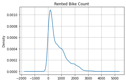
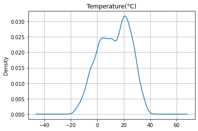
Kernel Density Estimator (KDE)
This method is calculating and plotting the estimation of the data distribution, and it is part of the Pandas built-in functions:
(
    bike_share_data
    ['Rented Bike Count']
    .plot
    .kde(
        title='Rented Bike Count',
        grid=True
    )
);
(
    bike_share_data
    ['Temperature(°C)']
    .plot
    .kde(
        title='Temperature(°C)',
        grid=True
    )
);
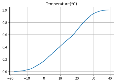
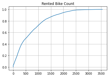
Cumulative Distribution Function (CDF)
The second option is using counts of the different percentiles of the data and using a cumulative plot makes it easy to find the value of each percentile and calculate the percentage of data points between every given percentiles.
%pip install statsmodels
Requirement already satisfied: statsmodels in /opt/hostedtoolcache/Python/3.7.13/x64/lib/python3.7/site-packages (0.13.2)
Requirement already satisfied: pandas>=0.25 in /opt/hostedtoolcache/Python/3.7.13/x64/lib/python3.7/site-packages (from statsmodels) (1.3.5)
Requirement already satisfied: packaging>=21.3 in /opt/hostedtoolcache/Python/3.7.13/x64/lib/python3.7/site-packages (from statsmodels) (21.3)
Requirement already satisfied: patsy>=0.5.2 in /opt/hostedtoolcache/Python/3.7.13/x64/lib/python3.7/site-packages (from statsmodels) (0.5.2)
Requirement already satisfied: scipy>=1.3 in /opt/hostedtoolcache/Python/3.7.13/x64/lib/python3.7/site-packages (from statsmodels) (1.7.3)
Requirement already satisfied: numpy>=1.17 in /opt/hostedtoolcache/Python/3.7.13/x64/lib/python3.7/site-packages (from statsmodels) (1.21.6)
Requirement already satisfied: pyparsing!=3.0.5,>=2.0.2 in /opt/hostedtoolcache/Python/3.7.13/x64/lib/python3.7/site-packages (from packaging>=21.3->statsmodels) (3.0.9)
Requirement already satisfied: python-dateutil>=2.7.3 in /opt/hostedtoolcache/Python/3.7.13/x64/lib/python3.7/site-packages (from pandas>=0.25->statsmodels) (2.8.2)
Requirement already satisfied: pytz>=2017.3 in /opt/hostedtoolcache/Python/3.7.13/x64/lib/python3.7/site-packages (from pandas>=0.25->statsmodels) (2022.1)
Requirement already satisfied: six in /opt/hostedtoolcache/Python/3.7.13/x64/lib/python3.7/site-packages (from patsy>=0.5.2->statsmodels) (1.16.0)
WARNING: There was an error checking the latest version of pip.
Note: you may need to restart the kernel to use updated packages.
from statsmodels.distributions.empirical_distribution import ECDF
import matplotlib.pyplot as plt
ecdf = ECDF(bike_share_data['Temperature(°C)'])
plt.plot(ecdf.x, ecdf.y)
plt.grid(True)
plt.title('Temperature(°C)');
ecdf = ECDF(bike_share_data['Rented Bike Count'])
plt.plot(ecdf.x, ecdf.y)
plt.grid(True)
plt.title('Rented Bike Count');
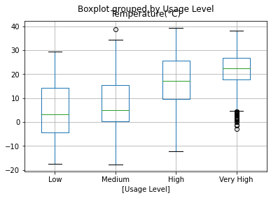
Group by Quantiles using qcut
When using a target score such as grades or number of rentals, it makes sense to use the split using the Quantiles of the scores.
bike_share_data['Usage Level'] = (
    pd
    .qcut(
        bike_share_data['Rented Bike Count'],
        q=4,
        labels=['Low', 'Medium', 'High', 'Very High']
    )
)
(
    bike_share_data
    ['Usage Level']
    .value_counts()
    .sort_index()
)
Low          2194
Medium       2186
High         2190
Very High    2190
Name: Usage Level, dtype: int64
(
    bike_share_data
    [['Temperature(°C)','Usage Level']]
    .boxplot(by='Usage Level')
);
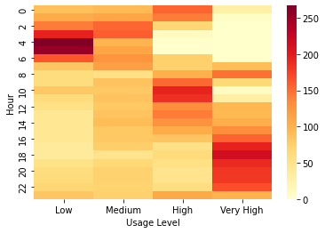
Heat map with the new value group
Now that we have the new value categories and we can create heat map to see the hours of the day that are the peak hours that can be used with higher price tiers.
import seaborn as sns
sns.heatmap(
    bike_share_data
    [['Usage Level','Hour','Date']]
    .pivot_table(
        index='Hour',
        columns='Usage Level',
        aggfunc='count'
    )
    .droplevel(0, axis='columns'),
    cmap="YlOrRd"
);